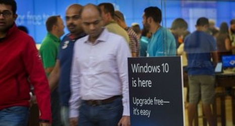
Windows 10 is Microsoft’s way of saying, “Oops.” And for any company that wants to stay on top, recognizing mistakes — and correcting them — is essential.
One of the most striking, and most welcome, features of Windows 10 is that it looks a lot like Windows 7.
Windows 8 pretty much bombed with users. Its new “Metro” interface, in which the initial screen was filled with tiles rather than the traditional icons, confused many users. Although you could summon up a Windows 7-like interface that, sadly, lacked the much-liked Start button, getting there was not intuitive.
