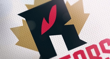
With a hat tip to the folks at Fear The Sword, graphic artist Addison Foote decided to embark on a project to redesign all 30 NBA team logos. The entire project can be found here.
Addison's thought process behind the redesign:
I wanted to do something different, but I felt like all of the good ideas had been taken with all of the Raptors primary and secondary logos. I didn't want to use a claw or show a whole raptor, so I ended up using a raptor's eye as the focal point in the "R" and then placed a maple leaf behind it to represent Canada as the Raptors are the only Canadian and non U.
