The Eagles unveiled a new logo font on Thursday, replacing their previous logo with a more straightforward and bold font.
The now old logo said “Eagles” in an arch shape, with sharp edges coming off of the “E” and “S.” The wordmark also looked 3D. Now, the logo is written straight, with those sharp edges now inwards on just the two “Es.” The font is still in white. It’s a more modern approach to the name.
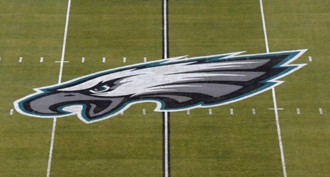
Additionally, the organization is keeping the classic eagle logo above the word. So, all that’s changed, really, is the font.