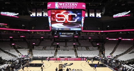
The San Antonio Spurs have gone through logo changes before, most notably shying away from the pink, orange and blue in their look from the 1990’s. They’ve stayed with the black, silver, and white for most of the past two decades.
NBA teams frequently change their look, whether it’s the logo or uniforms. It’s to update their look, sell merchandise and, in some cases, open a new era.
On June 9, Conrad Burry of SportsLogos.net uploaded the potential new look for the Spurs’ secondary logo. There’s an updated design for the primary logo, too, which may debut at the NBA Draft.
