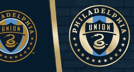
Bolder. Brighter. Cleaner.
The Union's new badge features a cleaner, simplified design, with a brighter, more vibrant shade of gold used throughout and one signal blue stripe down the center.
Secondary Logo
The Union's secondary logo now features the snake design utilized at the center of the club’s badge. The dark gold has transformed into a sleeker, brighter gold to match the club's primary logo.

Wordmark
And finally, the wordmark. The Union's snake at the center of the primary and secondary logo is now featured on the wordmark and continues the Union's brighter and cleaner look.
