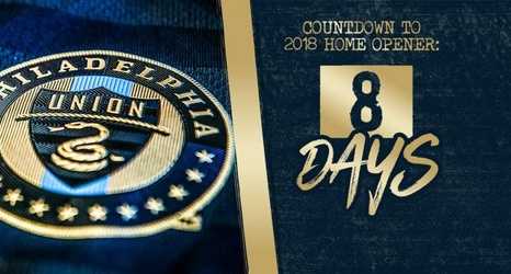
This year, Philadelphia Union has made several changes – especially with the club’s updated logo.
The Union have traded in their original gold for a new brighter and more vibrant shade. The logo also features just one lone blue stripe down the center.
As the Union enter their ninth season, Design Manager Shaun Kreider knew fans wanted a change and a new spin on the classic emblem.
“We knew we wanted a fresh take on both what we wear on the pitch, and what represents us as a club,” Kreider said.
Kreider also noted that some things were taken away from the logo for a cleaner, more simplified look.
