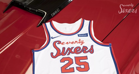
The Sixers have officially revealed their Classic Edition jerseys, and folks I gotta say, I find them to be pretty sexy:
I was a bit skeptical on how these might turn out after the team and team president Chris Heck dropped clues on the inspiration (an early 70’s Sixers uniform). The font is of a handwritten-cursive variety and missing some consistency, and I wish the outline was on both “Seventy” and “Sixers” or on neither. But I think the execution was near flawless given the inspiration. I love the cleanliness of the design and it definitely maintained a throwback vibe to a time when jerseys were simple.
