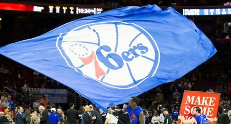
The Philadelphia 76ers have gone through a few logo changes in the past two decades. They have seen their brand go from patriotic red, white, and blue to a bad boy black, white, and gold look, only to go back to its origins. No matter the look, the Sixers (for the most part) seem to execute their branding strategy perfectly, from the court to the jerseys. It’s always interesting, however, to see what a crossover of old, new, and other iconic Philly logos would look like. Check out some of the logo mashups I’ve created.
Philadelphia 76ers Logo Mashups
