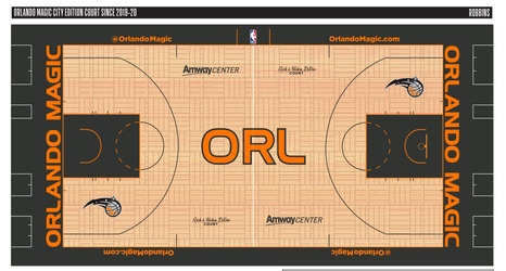
Orlando Magic fans have grown a bit bored with the team’s current look.
The Magic have had the same logo now since 2011. It is a fairly bland logo that lacks much character.
Instead of the stylized logo the team used for its prior history — including the iconic star for an “A” — it is simply the words “Orlando Magic” in a vaguely futuristic block font with the secondary logo the Magic have used since the 2000 season.
The Magic have had three logos in their franchise history, each one lasting about a decade.
