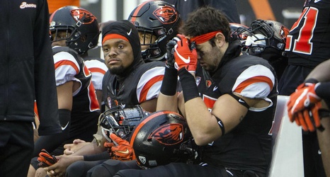
The Oregon State football team unveiled their much anticipated new uniform designs on Saturday before the spring game. And they’ve been pretty well received on social media and the general public seems to be in favor of them, but let me tell you they are TRASH!
My first gripe, what is up with those weird block-like strips on the shoulder pads? It’s not a sleek stripe and it doesn’t flow with the stripes on the pants or the stripe on the helmets. It’s just very out of place and very strange looking.
This one is probably the most upsetting aspect of the new uniforms, why is there only one helmet for all three colors?
