Back to the Oklahoma City Thunder Newsfeed

Some new Thunder logo ideas

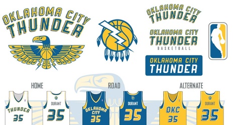
So naturally, with that in mind, the enterprising graphic designers and photoshoppers of the world have taken a spin at a new look for the Thunder. Via r/nba, here’s a sampling of what creative people have come up with (there’s more over there to look through). The big takeaway: It’s really hard to come up with a good idea for a sound.

G8CMTK7
I don’t know why the “K” is backwards in the bison one (is that a bison?), but I dig the whole concept there.
NcOzXp2
Going with the Thunderbird theme, there’s some good stuff here, especially the middle logo combining the state flag in with basketball and thunder (sort of).