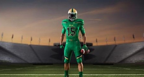
The new threads are out! Let's break them down stitch by stitch.
Jersey
By itself, this top is fairly attractive.The lighter shade of green looks nice and certainly doesn’t look dopey as a uniform color.My first big problem comes with the stripes on the shoulder.I think Under Armour should have gone with just blue or gold, not both.The two-tone effect with these stripes does not seem to match well with the color green they chose for the rest of the jersey.Outside of that, the green strips that seem to cut across the broader blue and gold stripes seem a little out of place across the chest.
