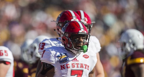
I’ve been waiting for NC State to do this for a long time, which is probably a strange thing to say, but it’s bugged me that the school hasn’t always had a consistent font across all sports. State used to have multiple apparel companies providing uniforms and equipment, which was a mess. But no more!
Not everyone will like it, I am sure, but at least it is a distinctive look in contrast to the mundane block lettering that NC State has been using on uniforms up to this point. Don’t know yet how this will look on the uniforms, but I’m optimistic.
