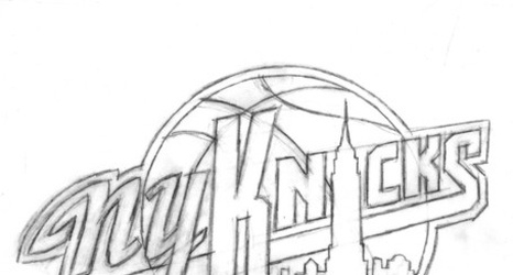
[Here’s a classic P&T piece by Seth Rosenthal about the design of the Knicks logo. Originally published on September 11, 2012. Enjoy!]
This is the current Knicks logo. This is what the Knicks logo looked like in 1992. Little has changed, y'all. They added a little "New York" and modified the colors recently, but have done nothing else to alter a design that's been the primary logo for over twenty years. That emblem has been a constant symbol of the team, and its distinctive big, block lettering echoed throughout several other teams' redesigns in the '90s, some of which are still in place today.
