We’ve have a number of logos and a number of characters at CN. Here’s a little history.
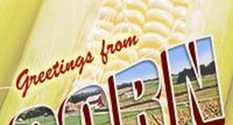
Below is Corn Nation’s first logo.
When the web site was first built I specifically asked for a logo design that would feature combines in a cornfield with a postcard look and feel in mind. I still love the look of it, but it doesn't fit today's standard web design.
I did get some comments early on that I was promoting the “hick” side of Nebraska and making the state look bad, but if that’s something you worry about you really need to find another state, one you can be proud of.
