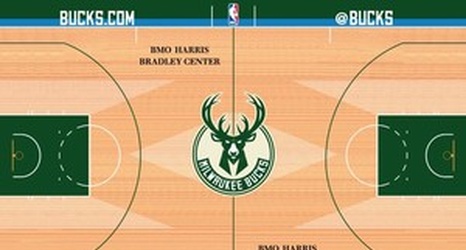
With the Milwaukee Bucks' new logos and new uniforms revealed in the past two months, just one major piece of their visual branding was in need of an update: their court.
Zach Lowe has some great background on the process behind the redesign at Grantland, with lots of color from Bucks VP of Marketing Dustin Godsey on what the team considered en route to the final design. And while everyone's entitled to their opinion, I'd say the Bucks more or less got it right with the finished product. The new font looks good, the blue wrap is interesting (if not somewhat debatable), and I was relieved to see the Mecca-style M's retained over the newly-stylized "M" symbol.