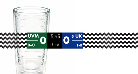
If you’ve watched a Kentucky basketball game on ESPN or the SEC Network this season, you’ve surely noticed the new graphics, specifically all that chevron. From the scoreboard to the sidebars, ESPN looks more like an Etsy page or Pinterest board from 2013 than the Worldwide Leader in sports. What gives?
Upon first glance, the graphics may seem low budget, but upon further review, I think ESPN actually spent a lot of money making the scoreboard look like a Tervis tumbler. In a desperate attempt to connect with a younger audience, they overhauled the graphics with bold patterns and animations to say, “Hey, look, we’re cool now!
