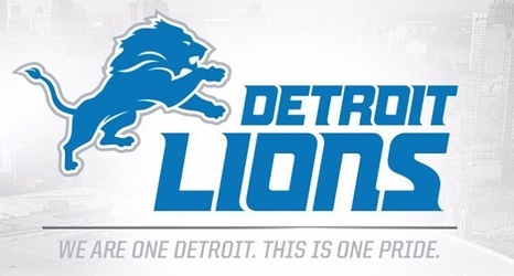
The change is small, but in the world of logos and how a team displays itself, it’s noticeable.
The Detroit Lions made small shifts in their logo and font of the franchise name Wednesday morning, changing it on both their Twitter accounts and on the team’s website.
Out is the black outline of the Lion. In is a softer gray outline, somewhat fitting with the team’s color scheme. Also out is the old font for “Detroit Lions,” taking the accentuation off of the “L” at the beginning of the team nickname and moving it to the “S” at the end of the name.
