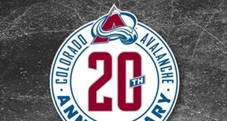
The Avalanche unveiled the official logo for their 20th anniversary yesterday. The announcement did not include any of the usual long-winded explanations of what went into its design, but that may be because it's about as standard as you can get. It's a circle with "20th" in the middle, surrounded by Colorado Avalanche Anniversary and the logo at the top. What's to explain? "We've been here for 20 years! We've indicated it with this logo! Don't overthink these things!"
I'm sure many fans are annoyed by the lack of panache in the logo, but a quick Google image search for "NHL 20th Anniversary logo" reveals that most of the NHL anniversary patches are.
