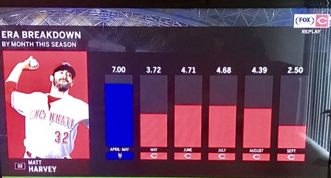
If you were watching last night’s FSO broadcast in the bottom of the 2nd inning, you saw this graphic regarding Matt Harvey’s ERA:
Let’s take a closer look at the chart and what it attempts to prove. The first bar on the left (blue) shows Harvey’s time with the Mets. The subsequent columns are the month-by-month values of Harvey’s ERA. Each month represents three (Sept) to five (June, July, August) starts.
