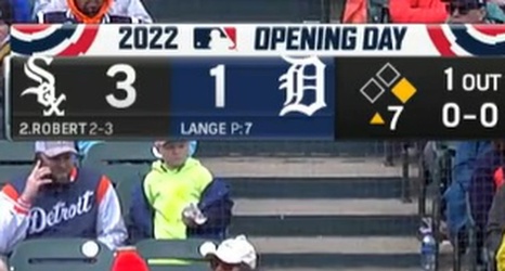
The folks at Awful Announcing today pointed out a couple of changes in scoreboxes for several regional sports networks.
One of them works all right, though there was nothing wrong with the old one. The other one is another head-scratcher.
Let’s start with the head-scratcher. It’s the White Sox channel, NBC Sports Chicago (and the rest of the NBC Sports RSNs):
:no_upscale()/cdn.vox-cdn.com/uploads/chorus_asset/file/23377088/FP2HTQ8VkAEfkgq.jpeg)
I mean... this isn’t a bad scorebox, but their previous version was cleaner and better. This one is from the days when NBC Sports Chicago was still doing Cubs games:
:no_upscale()/cdn.vox-cdn.com/uploads/chorus_asset/file/23377095/nbcsportschicagoscorebox.png)
To me, it’s easier to read the letters than the logos.
