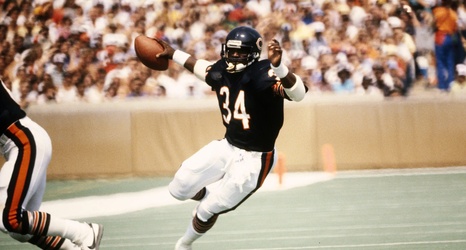
This season, I plan to bring some data visualization to this space each week. It might be something relevant to this season, a current player, or pulling something from the history books. Below you will find three data visualizations of Walter Payton to kick off the series. The numbers and images speak for themselves (I don’t need to sell anyone on the greatness of Walter Payton), but I wanted to try out help visualize his amazing career.
:format(webp):no_upscale()/cdn.vox-cdn.com/uploads/chorus_asset/file/22830349/Payton_Treemap.JPG)
Let’s start with a tree map to show Payton’s rushing yards game log by opponent.