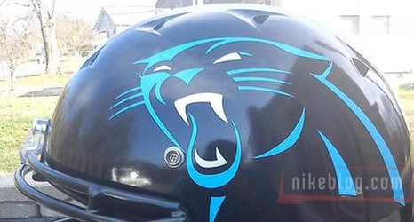
When the Panthers updated their uniforms in 2012, they made a few subtle changes to the logo, word font and shade of blue, and a lot of fans were disappointed at the meager effort to bring the franchise out of the firm grasp of 1973. But hey, at least we didn’t make our jerseys look like a big ass alarm clock, right?
Charles McDonald from SB Nation spoke with artist Nate James about which uniforms in the NFL could use an upgrade, and James broke down the uniforms into three categories: Outdated Modernism, Nike Hatchet Jobs, and Fauxbacks.
